Origin Coffee By Marina Porte


The foiling used on the type gives this unique coffee brand a feeling of luxury and prestige coupled with its complimentary darkened backdrop — the isobar-like pattern with a spot UV coating creates even more depth within this packaging design.
Something that should be considered in the UCC design is foiling. Using different metallics will differentiate each UCC product effectively whilst maintaining a feeling of quality and ridding of the bright red that sticks out within the context of a café setting.
Bakery House by One Giraffe

Choosing something radically different from the previous designs show how the current red UCC brand could be made friendlier and less corporate.
The Bakery House utilises a pattern based design that runs throughout their identity. This makes for a very approachable brand, even with the bright red corporate colour, it would still most definitely be considered as appropriate for a shop shelf that would stand out from the other brands.
This shows how the red from the current UCC identity does not need to be abolished completely as it is a very solid colour to use within the catering industry. It is strong and trustworthy, this could well be a large contributing factor as to why UCC is as successful as it is today. By simply altering the aspects of their product range that is visible by the end consumer will ensure UCC is deemed as the luxurious yet ethically based company that it is.
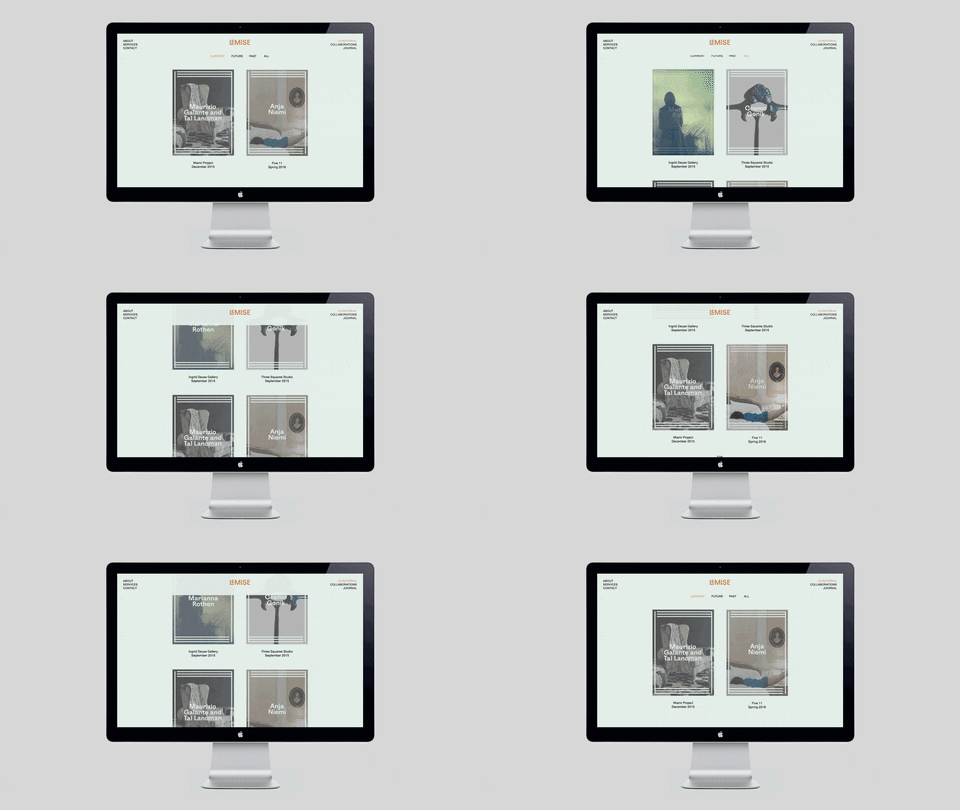
Le Mise By DIA


Le Mise is another great example of the effectiveness of foiling and how well it translates the feeling of a luxurious, high value product. The bronze coupled with an off white stock compliments each other very effectively.
This can be considered for the bags of coffee that will be sat on the café's worksurfaces. by using foiling, the bag will catch the warm lighting and stand out rather than stick out with the current red colour that is used across the UCC products.
Minerals Natural Care By Super Magic Friend

This would be the same story for coffee. Dark colours and metallic would best represent how the UCC brand should be perceived to the consumer. Minerals Natural Care could inspire the packaging in terms of creating a pattern, something that would humanise the brand and create a less corporate feel whilst maintaining the fact that UCC is not the average consumer/shop based product exuding a feel of exclusivity and prestige.

No comments :
Post a Comment