First thing's first, starting out with pen and paper I set out experimenting with what might work best within the context of the publication. I wanted to use a drop cap for the text blocks as I see this as traditional and not seen very often in today's design.
To progress on these initial sketches, expanding on the previous session on page canon, by utilising all of the content and placing it into a Van Der Graaf, it will reflect the idea of traditional page/publication construction.
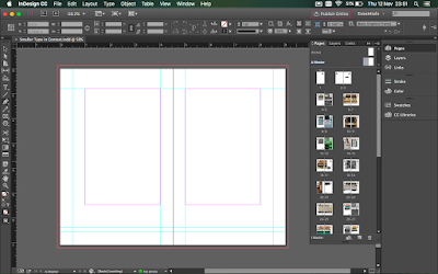
This is the final grid within inDesign. After using the above image on the document, figuring out where the page elements will fit will be much easier this way.
Initially, this was the outcome of the layout. However, the page just felt too empty.
By enlarging the image to full bleed, it's clear that as the book will be of a smaller size (115mm x 180mm) full bleed just helps to fill the page and put more focus and attention into the picture, with it being a photography/art publication this is the obvious and better choice to go for.
After a little bit of feedback, I was told that using a black and white filter will level out the pages and put more focus onto the page with text as well as the full bleed page.


No comments :
Post a Comment