Thursday, 30 April 2015

Posters - Studio Brief 04 - OUGD406


These are quick grabs from the field notes memo book as I had to add the colour behind the icon and text manually. 

The final outcome is quiet impressive on the coloured stock. I like the effect the laser printer has given on the black lines. (Note the wiener poster has come up red within indesign for some reason, it should be orange)

Final Icons - Studio Brief 04 - OUGD406

These icons are to go on my posters along with a witty title of advise.

I thought I should incorporate humour into it to make it more appealing and interesting:

 
= Keep a sharp pencil

Meaning make sure you keep a 'sharp mind' and keep thinking of fresh idea's.


= Don't grow a beard

I wanted this to communicate to think as an individual, don't blend in wit the crowd and separate yourself from the rest.


= Ignorance is not bliss

Listening to your peers. Something in which I have struggles with  in the past year and know I need to address to progress in Level 5.


= Blood, sweat and beers

It is vital that you get the work done. But don't put off going out with friends, meeting new people and having fun. As this is a vital part of PPP anyway, so there's the excuse to go and live life.
= Whiners are wieners

Instead of moaning about work, get it done, don't let yourself get unmotivated and love what you do.

= Red bull doesn't give you wings

As I myself have learned way too many times before, leaving work to the last minute will only make matters worse.

Field Notes - Studio Brief 04 - OUGD406

For a little addition on top of the poster series I have decided to do a last minute notebook in the style of Field Notes, a memo book brand that appeals mostly to creatives.


Field notes come in all different colours but are always small enough to carry around with you. I will not be making them THIS small due to the book making printer only being able to produce a4/a5 books.


Here are just a few of the colours they do; I will mostly be focusing on the books below, their limited edition 'unexposed' pack. This is to utilise the paper I have left over from creating my posters.


I will be doing a blue on red colour way. As a gift for the freshers and as an 'all you'll need for the week' sort of thing.

A 10x10mm grid will be my choice for paper as this is useful in both writing and drawing. I will also include my posters on each page as a little reminder/inspiration for whats to come on the course.

Iconography - Studio Brief 04 - OUGD406

Iconography is everywhere these days, I mean, everywhere.

Designers seem to me churning out icon packs after icon packs for god knows what reason.

So I thought it'd be best for me to select a few I thought would suit the style I'm after. This may seem like an easy task but from the sheer selection that's out there, a lot of them just look the same.


Noor Bank

These are by far my favourite of my selections. The clear use of a grid makes them more appealing to me as I love that structured look of icon's/logo's.

As per my own work, the use of a 10% background and 90% linage really makes the icons stand out. 

One thing I would like to do differently with my own though is to use softer edges. Make it less harsh and more inviting or even less intimidating as this is for freshers of the next level 4, things should be relaxed as it is quite a stressful time to endure. Especially with all the things going on like getting accustomed to your surroundings and dealing with 2 hours sleep with a hangover in that lecture theatre, it's not an easy time.


Gregorius T. Rofi


Introducing a little colour.

Gregorius has stuck to 2 colours in each of these pieces I would like to incorporate a lot of colour within my designs but think it would make more sense to use coloured stock to really have the pieces of work stand out on the white backdrop of the studio.

Victoria U.


I have selected these workings to show a bit of a negative effect, light logos on a dark backdrop is something which I would have to screen print or go to digital print to get done. This is not what I'm after as being a student, and the brief being called 'speaking from experience' I would like to stick to a strict budget and keep costs as low as possible.

This then leads to me to printing techniques. 

I will use the laser printer in the studio as well as using the coloured stock from the library which is 30p per a2 sheet and I plan on making 6 a3 posters in total.


Visual Research - Studio Brief 04 - OUGD406

Speaking from Experience.

I have chosen to look at current posters that use similar styles to which I would like my posters to represent.

Choosing to look at only posters that represent a word or phrase in a visual way to gather a healthy body of things to reference back on during my idea generation.


Tata&Friends

The following posters made by tata&friends represent rock bands by using effective iconography which is booth clever and imaginative as visuals.


I adore the layout they have used in these posters and can imagine myself using something similar myself. Not only would they work great as posters but they would work great as a book. This is something else I could use to represent my own designs. Colour choice is a bit of a weird one, I can't quite understand why they used yellow, but then again the versatility of such posters any colour would work.

Type choice is great, I think that it ties in with the style of the icons very effectively. Nice and minimal with plenty of space between elements also gives more appeal as it is not too overwhelming with content.


Musical iconography


By using famous scenes of album covers and video's, this designer has used an icon format to create some recognisable posters.

I think the main point of the style of poster I am trying to create is outlawing the need to have a title or explain the image more by putting a text on it. I think with a bit of analytics skill, which all creatives should have, you can come to a conclusion of what the posters is about just buy looking at the icon.


rastereYes


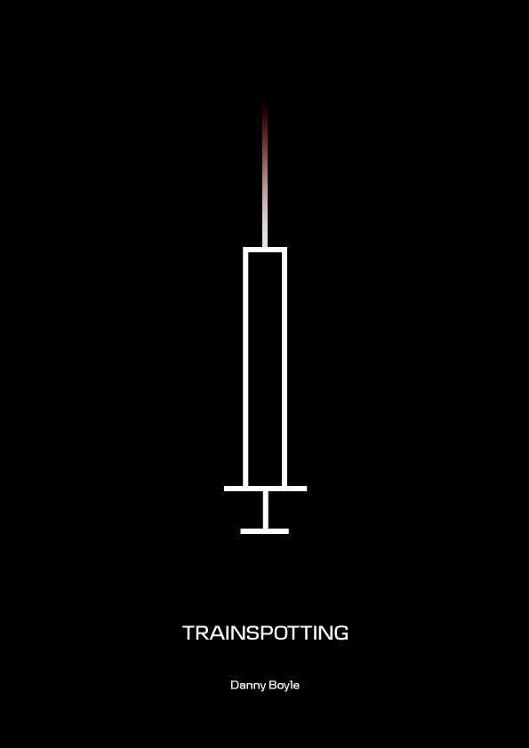
By using only linage. The designer under the name of restereYes has represented movies in such a way that would be difficult to differentiate, purely by placement and colour of the lines is the only thing that separates these ultra-minimalist movie posters.

I like the idea of using only straight lines but I think it would be lost in translation and conceptually speaking would not make much sense.

Making my designs look visually appealing to aspiring designers might is difficult as I want to engage them and make them want to read into the lines, these posters don't necessarily make me want to do this.

Speaking From Experience - Studio Brief 04 - OUGD406

For SB04 we have been briefed to explain what we would like the next year of students who enrol to know before they start the course.

I think this brief will be very beneficial as it will have a great impact on what the next generation of students will anticipate the course to be like.

My first thought was to do something along the lines of kinetic typography, but I have since reconsidered this idea as due to the time I have remaining and the amount of work I have left. I've chosen to do something more realistic and go with icons that represent different meanings, for example, visually representing the lines 'Don't quit', 'Stay motivated' or 'Set goals'.


My Brief:

To use humour and wit in a visual and conceptual way to engage the new students into taking valuable advise which will help them prior to starting the course.

Deliverables:

x6 Posters
x1 Freshers memo book

Invites / Flyers - Studio Brief 03 - OUGD406

Invitations:


Front of Flyers:


Rear of Flyers: 


All of the above final pieces were passed back and forth to each of our team so we could make alterations and make suggestions. This helped us as we had more time away from the studio, as it ww only were given 5 days before the presentation.

Exhibition Book - Studio Brief 03 - OUGD406


As a compliment for attendance, we thought it would be a nice idea to create a book that exhibited all of the final resolutions that were included in the exhibition.

Keeping the layout simple and easy-to-read was the way to go. Including a little blurb of the artist and what the piece entails to give the people walking around the exhibition a clue to what the final resolutions are about.

Posters - Studio Brief 03 - OUGD406


Same goes for these as the flyers and invitations, all final resolutions were passed around and altered. We wanted as many variations as we could get as we wanted to show how the combined styles of the team merged.