Wednesday, 25 March 2015

Milky Way and Andromeda - Studio Brief 03 - OUGD406

The COLABS concept for the constellation-like shapes are derivative from the coming together of galaxies, more specifically, our own Milky Way and Andromeda. This is due to occur in roughly 4,000,000,000 (4 billion) years from now.

How the merge will look like when it begins to tae place 4 billion years from now.

I have chosen to pitch this concept as it represents how us, first years will be exhibiting work along with the second year students, I do not like to think of this as a collision, because in actual fact it is quite the opposite. The joining of the two galaxies will be peaceful and harmonic as there is so much space between stars. The only detrimental part of the process would be a few stars being flung out of orbit due to the sheer gravitational effect the collision will give.


A simulation of the joining of the two galaxies. (Wikipedia).

The shapes are in the style of a constellation that is representative of the galaxies outlines:

An animation made to resemble both years of students coming together. (Created in Flash CC 2014)


This shape is the fundamental part of the branding, these shapes will be at the forefront of all pieces of collateral that we intend on creating.

Tuesday, 24 March 2015

Bookbinding - Study Task 04 - OUGD404

For this task, we set out to learn how to execute 3 different book binding techniques so we can put together our final piece as professionally as possible.

The binding techniques specified are:
  • Concertina Fold
  • Japanese Side Stitch
  • Pamphlet Stitch

All of the processes were useful to me as I will need this knowledge in the future for the binding of my final outcome, here are my notes from the session:


I will be documenting this further in the future when it comes to choosing which stitch/fold I want to use within my final piece. This will more than likely be the Pamphlet Stitch as it is the most simple/easily produced stitch of the lot.


Friday, 20 March 2015

Typesetting - Study Task 03 - OUGD404

Typesetting is a fundamental part of any block of text, large or small. The readers eye must flow across the page without any hiccups to make it as clear as possible.

Avoiding the following:


  • Orphans - A word at the end of a sentance on its own line.
  • Widows - A paragraph-ending line that falls at the beginning of the following column or page.
  • Rivers - A line of negative space that flows through a paragraph of text and creates an uneven sidebearing of words, often caused by justified text.
  • Improper point size - Type can be harder to read when too small or too big.
  • S t r e t c h i n g and Squishing  - When type is tracked incorrectly.

Presentation:


Group Task

We were separated into groups of four to create a representation of the poem 'A Mouses Tale' by Lewis Carrolls in a post-modern and modernist way.


Post-Modern

For a post-modern approach, we opted for a literal way of representing the poem, a mouse had was the go-to response. We felt this wasn't quite enough so we threw a script typeface into the works, we agreed it really gave the piece a post-modern feel and exuded the fact the poem is a classic. as we thought the style is quite illegible and practically the opposite to modernist.


Modernist

The modernist approach I had little say in, but the overall concept of the piece was to exaggerate the fact Helvetica is standard practice when representing something in a modernist way. The mouse head was to show consistency throughout designs, I didn't agree on putting it there but my voice was overruled in the final decision. If I were to change it, I would create a simple grid to go by rather than shooting blind and using flush left text, on the left hand side of the page. I like to think Modernism is a little more complicated than this.


Neue Hotdog - Study Task 02 - OUGD404

Neue Hotdog Foldable Book

The final outcome to my hotdog fold.


Overall, this task was fun to endure. Finding little mistakes and fixing them gave me satisfaction and opened my eyes to how easy it can be to make them in the first place.

Folds - Study Task 02 - OUGD404

Making a book out of a single sheet of a4 is easier than is seems.

With using what is called a hotdog fold, it is possible to create a book without any waste using a pair of sisters and a standard piece of a4 printer paper.


The Hot Dog Fold


As shown below, I have taken the necessary steps to produce one of these booklets myself. The folds are self explanatory, it was a hell of a lot more simpler than I originally anticipated.


When the page is folded in half after slicing the centre, the paper will gracefully fit together without any fuss.


The resulting output being this below:


 Within this booklet, there are a total of 8 pages including the front/back covers.


Task


The given task for us was to take this booklet, or any other folding booklet we may find or create ourselves, and create an instruction based template played out in the same style of the unfolded book.


I chose to stick with the classic hot dog fold as I assumed it would be more use to people looking to create something of the kind, rather than some wacky made-up book that makes minimal sense.


To begin, I made a simple template within Abobe Illustrator to give me an idea of what orientation and order the pages go in.


To begin, I split a standard a4 document up into 8 equal segments with the ruler guides.


I then labelled each page to resemble which is which. (I later found this was incorrect and was later fixed.)


I then made some borders so the user has a little bit of give either side of their folds, just incase it isn't quite perfect.


For inspiration, I chose to go with the classic form over function Müller Brockmann style. Why? Because it has a classic, straight forward, easy to follow justified left style. Something of which you don't see too often in todays instruction leaflets/booklets.

I made sure I was staying true to the Neue Grafik style and researched what fonts were used. The outcome was as follows:
Titles: Berthold Akzidenz Grotesk BE (Bold)
Body: Helvetica (Regular)


Adding the content to my instruction booklet was easy. Giving the user an idea of what goes where and how to create the booklet on the rear page.


After some fine-tuning, and a few test prints, I was able to spot mistakes like this orphan:


To conclude the making of my 'Neue hotdog' booklet, I found this task had a lot of meaning in the sense of going back and fixing issues through trial and error, and also ensuring that the document is full ready before rushing to send it to print like I did at first. My choice to rearrange the order of which they were in was purely for ease of use. I found that when you put the pages together to construct the book, the order seems to fit into place without much hassle compared to the original order they were in.

Wednesday, 18 March 2015

What is a Book? - Study Task 01 - OUGD404

This is anything but an easy question to answer.

Books can range greatly in its content, from Dictionaries to takeaway pamphlets and a Bible to Darwin's Origin of Species, all of which are the same thing, a book. The main noticeable difference between them all the content, whether it is to inform, educate, advertise or to simply write down your thoughts.


Notebooks

I love a good notebook, the aesthetic and feel of it is always more satisfying than a word or indesign document stored on my computer. It is physical and not on screen. You are free to write, draw, doodle or create idea's however you want.

Below is an image of my absolute favourite series of notebooks, the Eames House of Cards collection:


This shows how something with an effective cover can be so appealing to the right audience. A book should grab your attention, whether it is through the meaning of its content, design, layout, functionality, or even by its cover, as you can tell I never did like the saying 'Don't judge a book by its cover', in this case, I'd say it's worthy of being excused.

The Eames couple are a huge inspiration to many, this meaning that a notebook like this would be more suited to someone who knows who they were and what they did, although on the contrary, that is not to say someone would chose this because of its function, these to me are a great alternative to the more bland looking moleskine, which are also blinded using the same technique, the perfect  bind. 

But people will chose what they want based on their desires, which if you need blank pages to add ink to, any kind of notebook will do. Providing you're not so keen on the saying 'Form follows function', you know, if you're into that sort of thing...


Magazines

I am choosing to look at a few different zines to give me an idea of what kind of things are on the market and how the are portrayed in my own eyes. Analysing different publications in and out will give me a good perspective on how I would like to treat my own designs in the future.


Little White Lies


LWL is a movie review mag which often include many cover arts by designers, illustrators and artists alike. I's all about the cover with this mag, they have little content on the front to encourage the reader to look more into he content of it rather than it be spoon fed to the audience through cheesy, unnecessary bold type scattered all over the show. Which you will certainly see below.


It will often attract the kind of person that prefers a more sophisticated style of magazine, that will tell them what they need to know about the latest and upcoming movies with no hassle. OK!


Dare I go there. OK! magazine, I like to refer to this as The Star and The Sun's love child. The epitome of red top style publication. Target audience as simple as its cover design, content is predictable and easy to read for this very reason.

Not comparable to the other magazines I have chosen, although I like to keep my research varied and this is an extremely poor example of a book, but, it is still a book and is relevant for this research.

i-D


A zine relating to fashion culture. i-D is a great example of how to get it right. I like how they keep the focal point of the magazine to the image on the front with a logo in the same place every time, and a little list that doesn't obscure from any of the other elements no the page.

So, to sum up, I have focussed mainly on magazines because the outcome of this project is similar. Taking a varied approach has helped me realise what I need to avoid and similarly what I want to look for when I come to produce my 10 page spread 'book'.


Time Management - SCRUM Chart - All Modules

I can admit my time management hasn't been the best so far. I have attempted a Gantt chart but felt there was no benefit whilst working towards my goals.

So I did a little more research into it, and I found the SCRUM chart. This is something more often used within software development to meet goals for a certain time frame. Something of which I found would be more useful to me, as I can visually interoperate how much I have to do and in what time I have left to accomplish it.


By using scotch magic tape curtesy of the course starter pack, I have devised a similar sort of strategy into my own line of work by using the same methodology to apply myself to complete tasks within a given time.

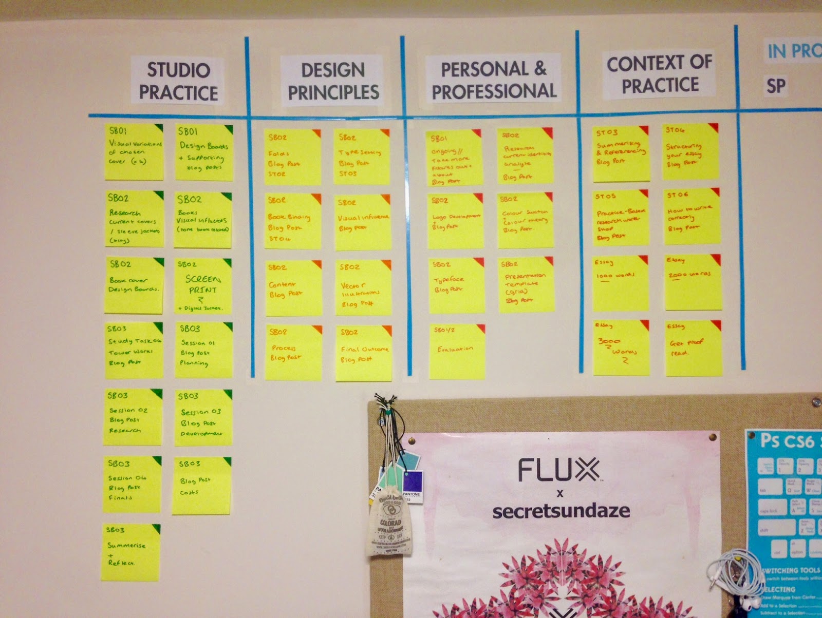
This is the board filled with all the tasks I have left to complete. I have colour coded each post-it note to ensure it can be easily visually interpreted (Something the camera doesn't quite pick up on), I also split the chart into clearly visible columns to separate each task. From Studio Practice to Context of Practice, it's all there separated into their individual study briefs and study tasks.

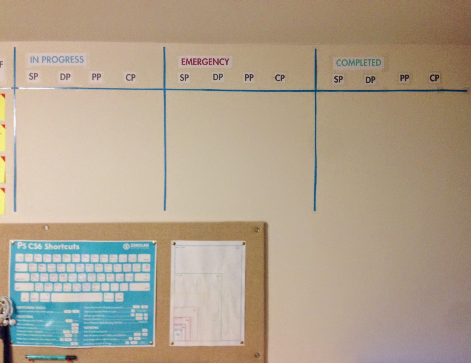
With time, I will slowly begin to move the tasks along the chart until they are completed. I have included an emergency column which I hope I won't have to use, this is for tasks which are due within the next few days and have priority over the others.

Being that this is an interactive form of tracking my time, I feel I will benefit more form this than any other method to time management.

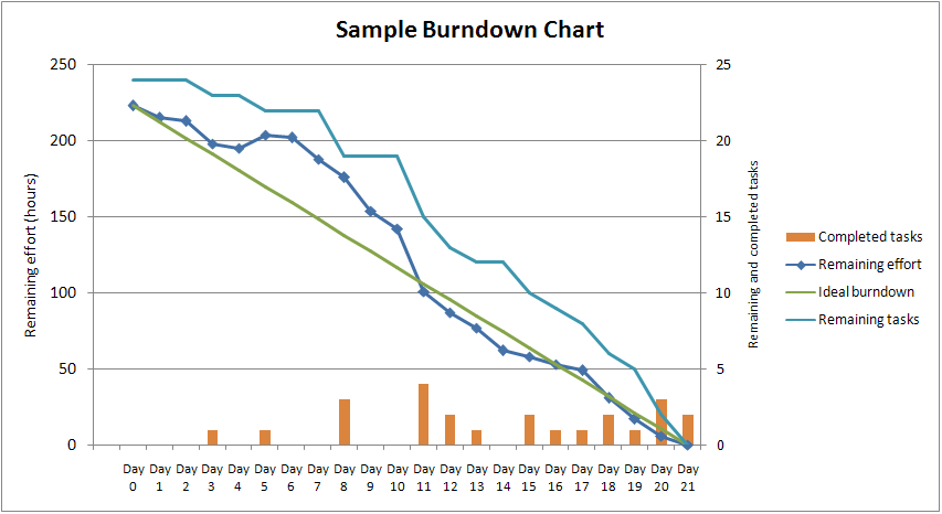
Later, a burn-down chart will be added along side the scrum task board, this gives me an idea of my progress within each aspect of the course and a line I can follow to ensure I am on track to complete all work within the given deadline.

An example of the kind of burn-down chart I will be using for each module of the course. (Source: Wikipedia)