Beginning with my 6x4 image, the Holborn Towers.
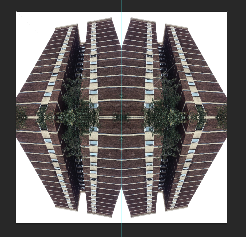
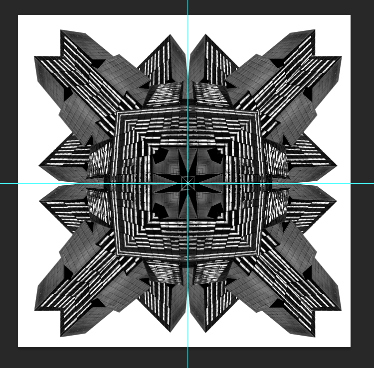
To begin, I dragged thew image in, flipped and rotated 3 other duplicates of the picture to get the desired effect.
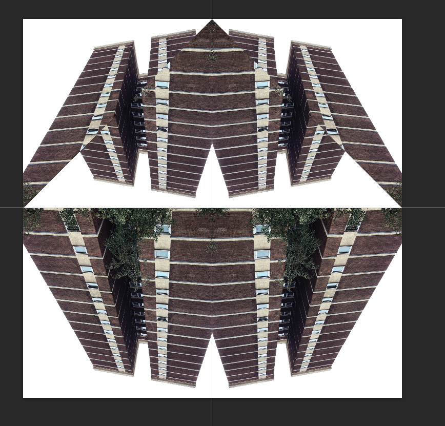
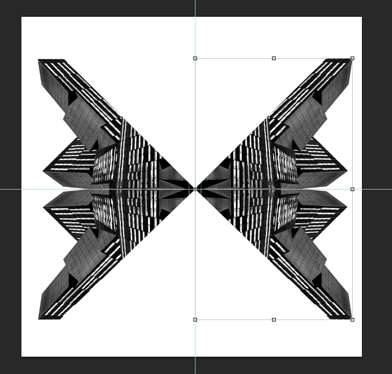
Then by using the marque tool, I selected a triangular portion of the whole image and flipped it vertically.
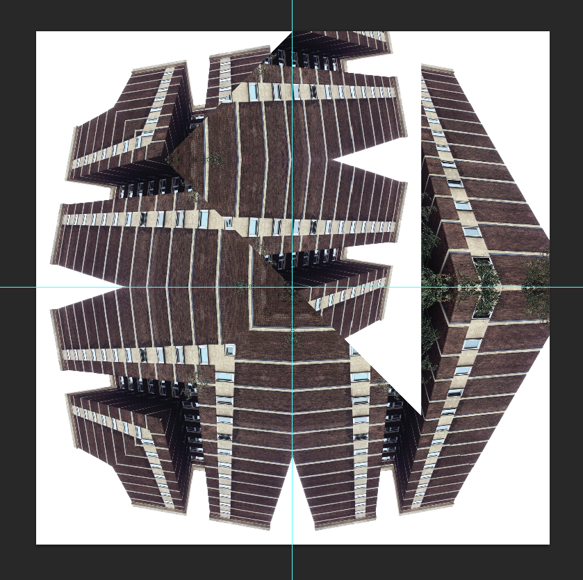
Then with he remaining sides, repeated the step and the image below shows the end result once I'd moved it into position.
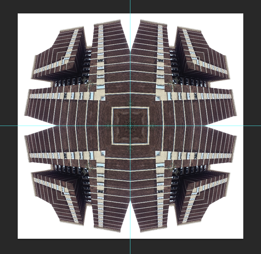
Here is the finished piece without any changes.
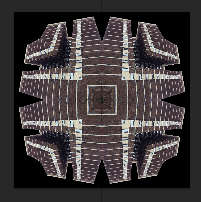
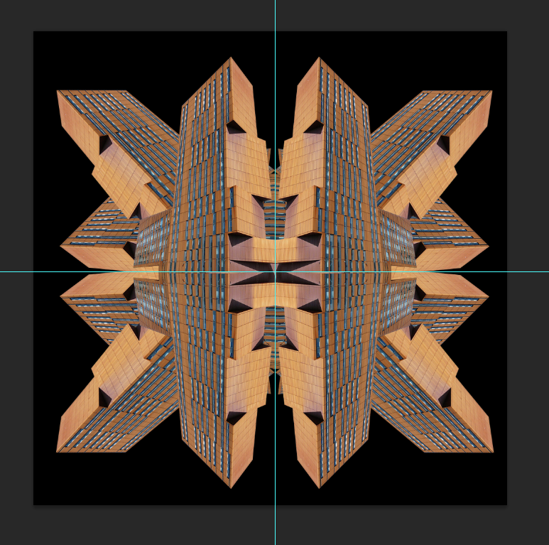
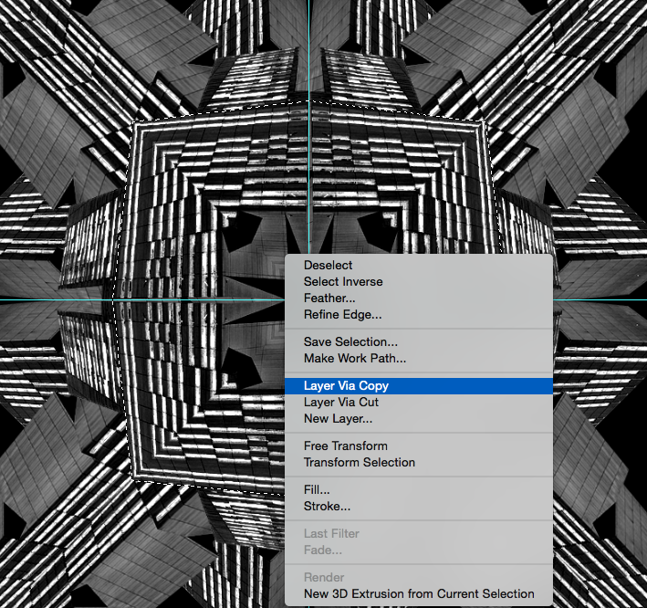
To give the image a bit more backbone. I used the magic wand to select all the white and deleted it. Then by using the square tool, I created a black background behind the layer of the building (Which I had now merged as I was happy to flatten it.
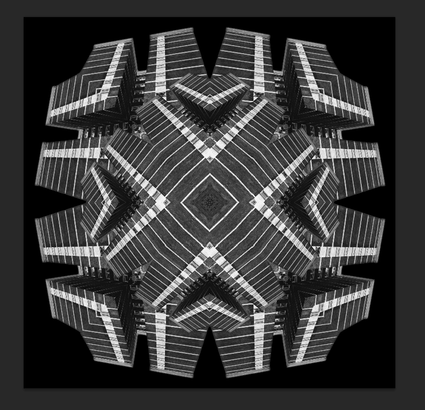
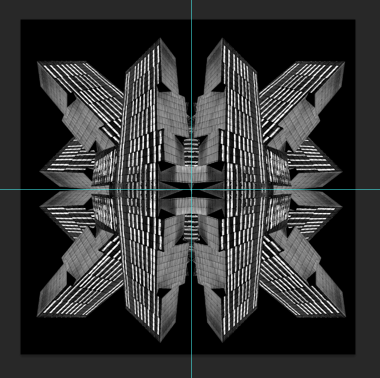
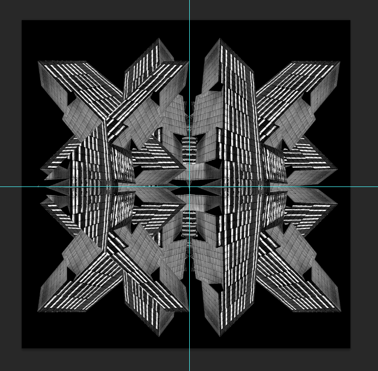
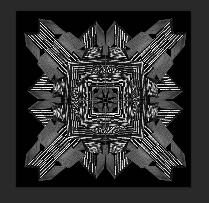
Whilst I like the effect adding a black background gave the image, I think the image looked too pure keeping the colour. So I converted it to black and white and then repeated the buildings to make it look as if there was a circle within the outer rectangles.

To give the image more of an impact, I upped the saturation by +50.
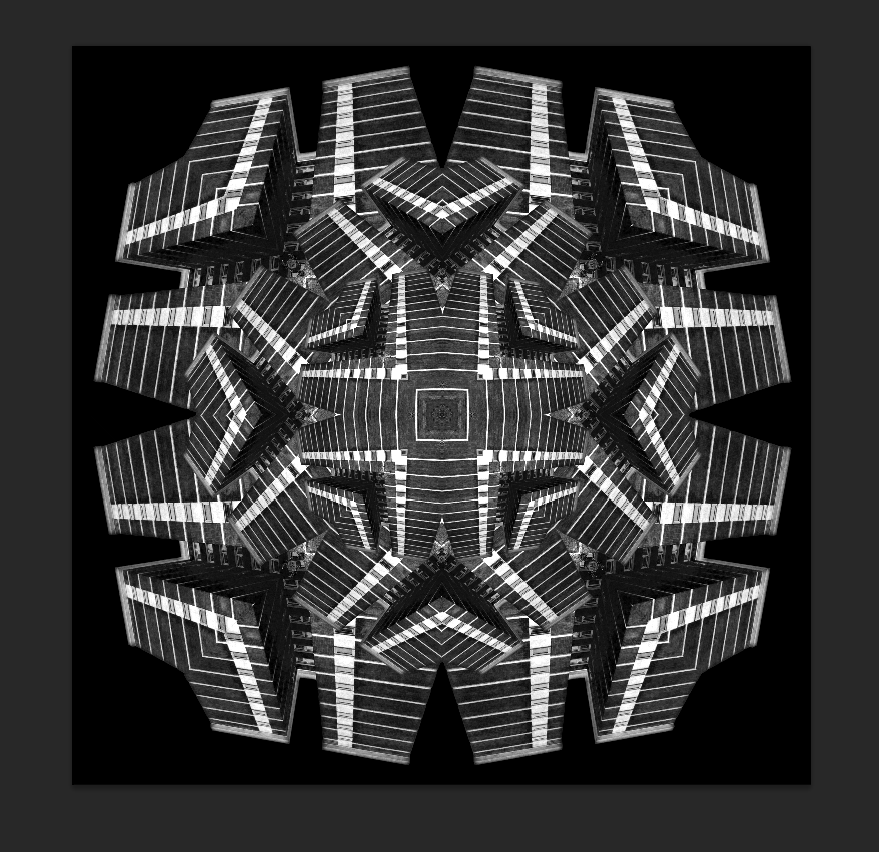
Finally repeating the image once more made it look like an optical illusion, something of which I wanted to reflect within the final outcomes.
7x5 image, Broadcasting Tower.
This was made using a very similar technique to the one above so I won't go into great depth on how it was made.
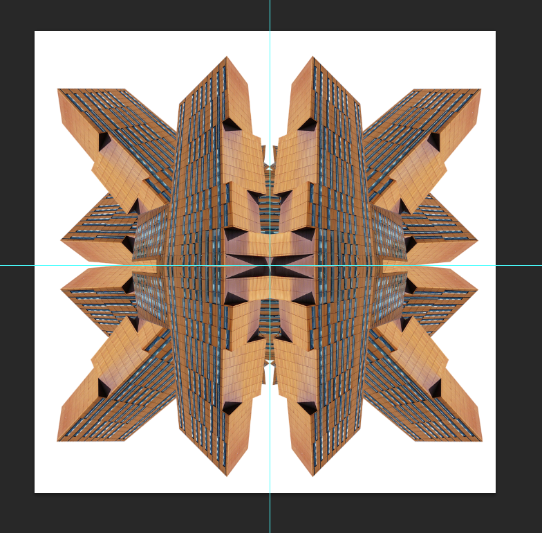
Step 1 shows the repetition of the original image being rotated/flipped.
8x6, Opal 3 Accommodation.
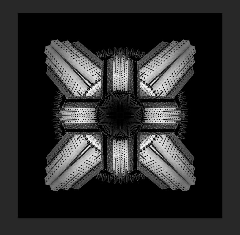
Same applies to the other 2 images, along with different shapes to give a bit of diversity within the series.

No comments :
Post a Comment