Friday, 5 December 2014

Frames - Studio Brief 01 - OUGD405

I chose to do my primary research in Wilkinson's as I thought that it was my first port of call when I thought of a photo frame.

I decided to take a few pictures of the photo frame isles to gather various information on layout and design of the photo frame inserts.


At the end of an isle as pictured her, I found that every single design used was generic, the only difference between frames were the sizes that were stated on the front of them.

"Brighten up your space." The use of incorrect grammar and an awful 'curly' type made me realise these frames were possibly the worst example of an insert.

The same as every other frame but with the addition of "For golden memories.".


To conclude my quite disappointing findings, I quickly realised how not to execute this task, I think the use of a lot of white space makes it look cheap and 'basic'. As my target audience is that authentic 'Made locally' aesthetic, I knew I had to virtually do the opposite to this.

This is why I chose to create something that supports local shops and would appeal to the audience it is made for.

Thursday, 4 December 2014

Final Designs - Design Process - OUGD405

My previous blog post shown how I manipulated images I had captured of local buildings to create a kaleidoscope effect.

This post will describe how I have created my final designs presented in the correct manor, for example size and text added via Illustrator.

All of the designs have been made to support local shops within Leeds as they are all symbolistic buildings from the heart of the city.


6x4 - The Holborn Tower (Actual Size)

By adding the text in Illustrator I was able to keep a consistency in the text and make it larger for the other 2 posers without any pixel distortion.

7x5 - The Broadcasting Tower (Actual Size)

My font of choice was Baskerville. This is because I think it doesn't take your attention too much away from the main image and it's a timeless classic, kind of how a building should look.

8x6 - Opal 3 (Actual Size)

Overall I am pleased with the outcomes I have produced, I think they represent my research in a good light. The concept of supporting local shops was also a bonus as it is a strong USP for the consumer in this day and age.

Image Manipulation - Design Process - OUGD405

This post will explain the process in which I used to give my images the kaleidoscope effect within Photoshop.

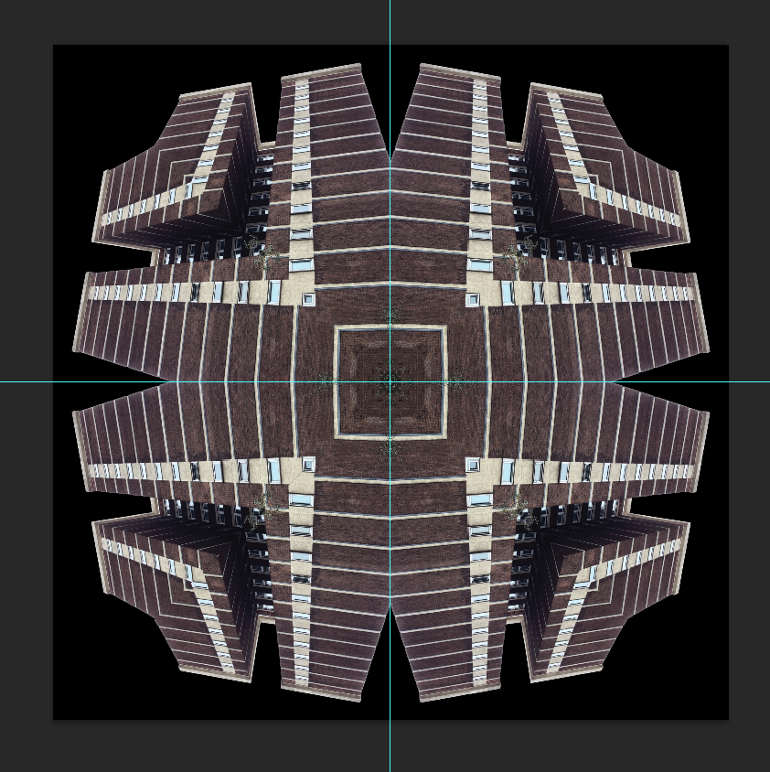
Beginning with my 6x4 image, the Holborn Towers.


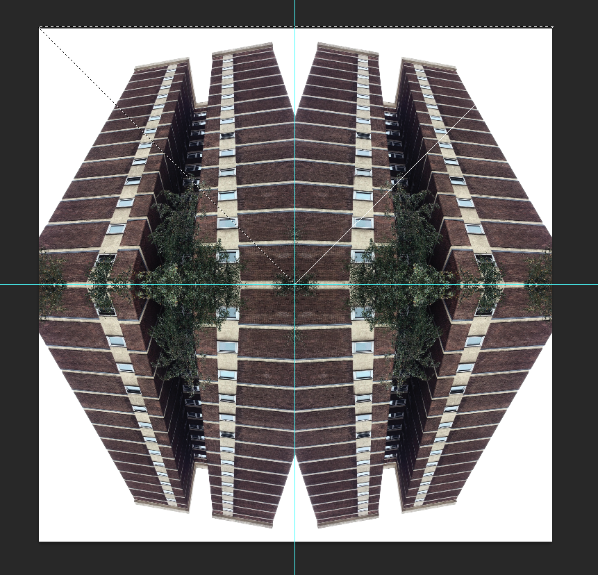
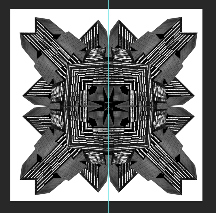
To begin, I dragged thew image in, flipped and rotated 3 other duplicates of the picture to get the desired effect.


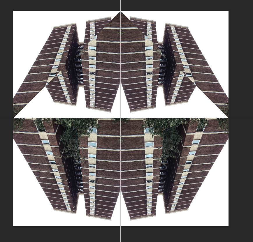
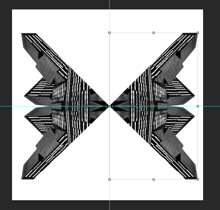
Then by using the marque tool, I selected a triangular portion of the whole image and flipped it vertically.


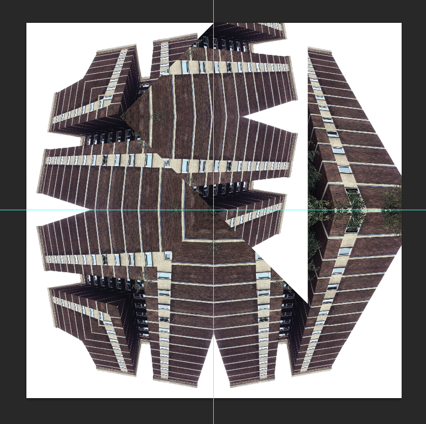
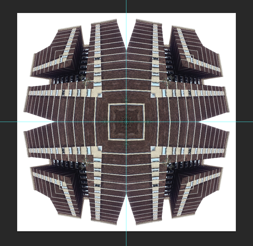
Then with he remaining sides, repeated the step and the image below shows the end result once I'd moved it into position.


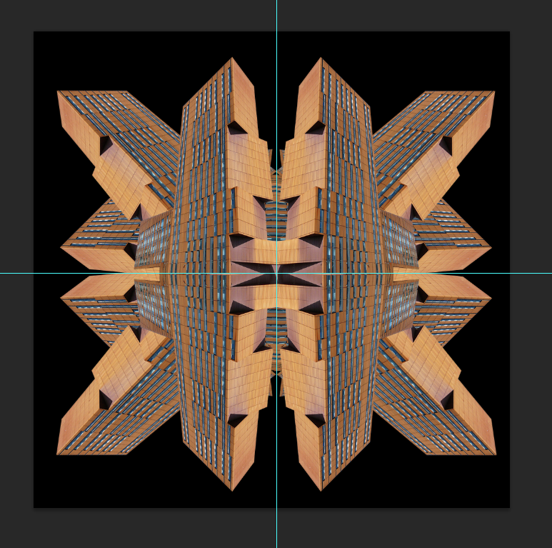
Here is the finished piece without any changes.

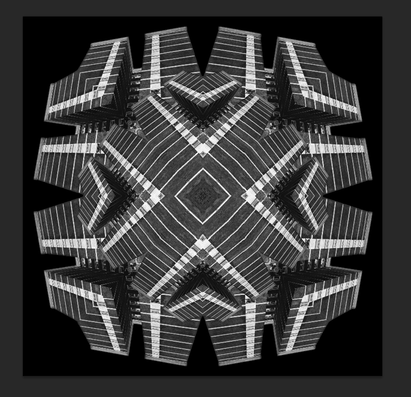
To give the image a bit more backbone. I used the magic wand to select all the white and deleted it. Then by using the square tool, I created a black background behind the layer of the building (Which I had now merged as I was happy to flatten it.


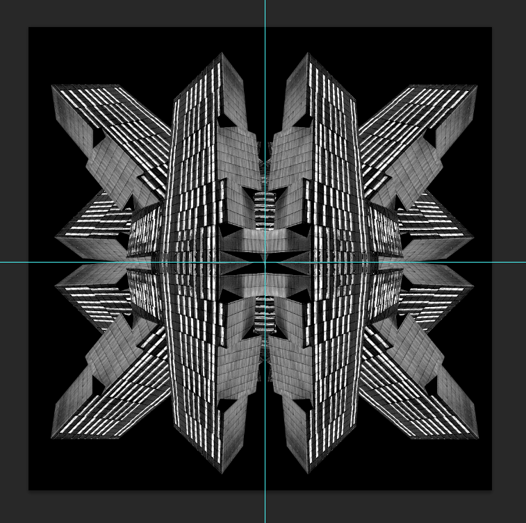
Whilst I like the effect adding a black background gave the image, I think the image looked too pure keeping the colour. So I converted it to black and white and then repeated the buildings to make it look as if there was a circle within the outer rectangles.


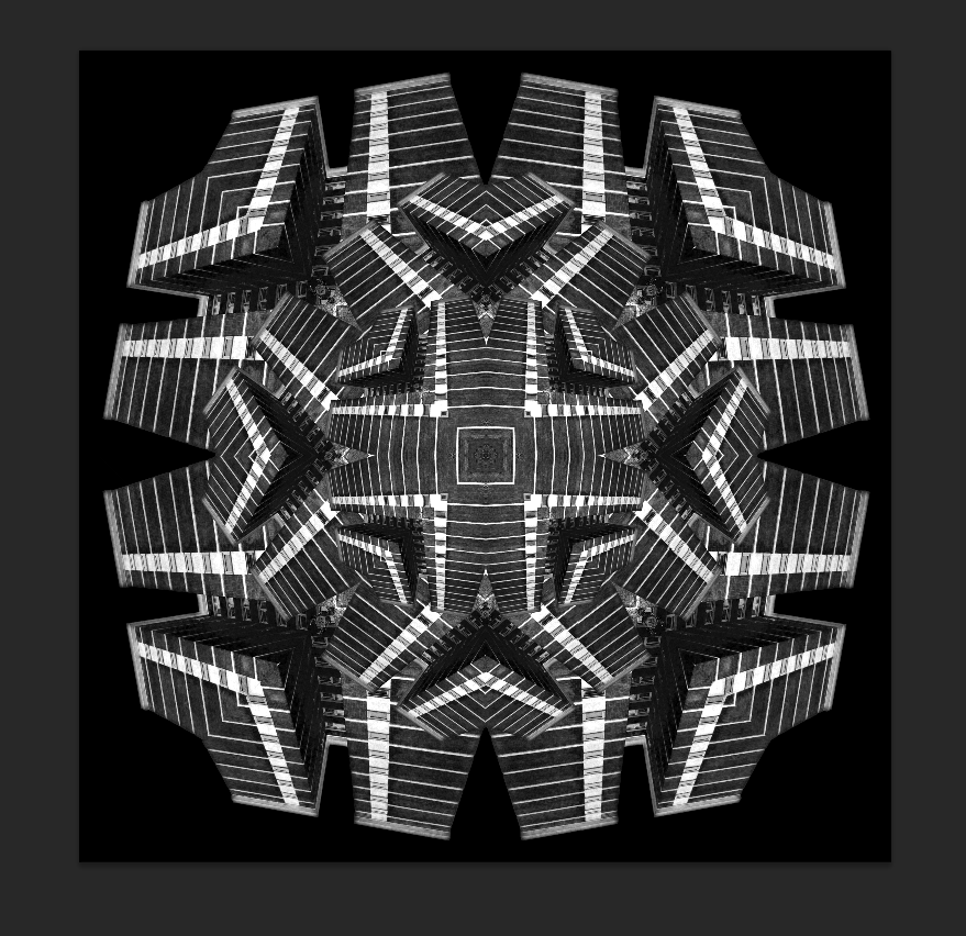
To give the image more of an impact, I upped the saturation by +50.


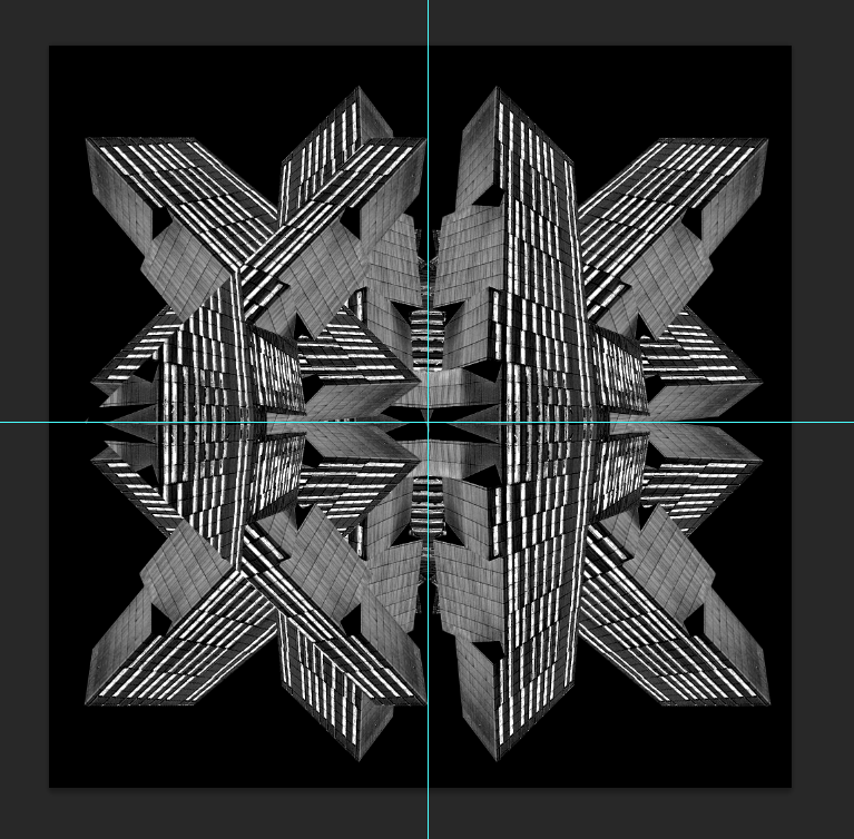
Finally repeating the image once more made it look like an optical illusion, something of which I wanted to reflect within the final outcomes.

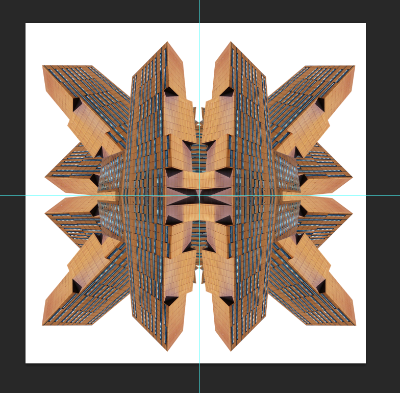
7x5 image, Broadcasting Tower.

This was made using a very similar technique to the one above so I won't go into great depth on how it was made.


Step 1 shows the repetition of the original image being rotated/flipped.


Step 2 adding the black background.


Step 3 applying a black and white filter.

Step 4 cutting the corner in which I think shows the most diversity in shape via the polygonal lasso.


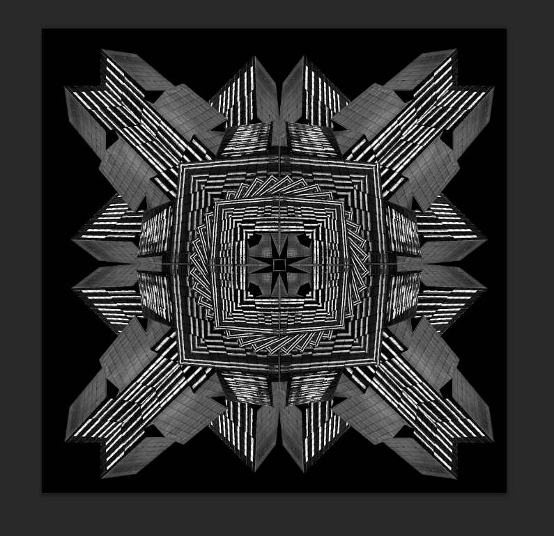
Step 5 shows the repetition stages to resemble the kaleidoscope effect correctly.


Step 6 shows how the final pieces go together, Kind of like a jigsaw puzzle.

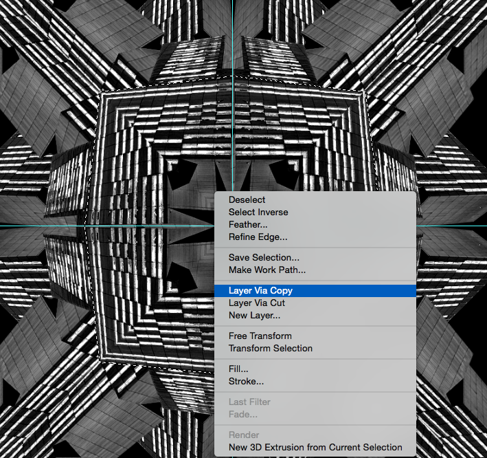
Step 7 is showing how I selected the inner square portion using the polygonal lasso, then creating a new layer via copy.


Finally, Step 8 is where I made the previous selection smaller and repeated it to create a circle in the centre of the image.

8x6, Opal 3 Accommodation.

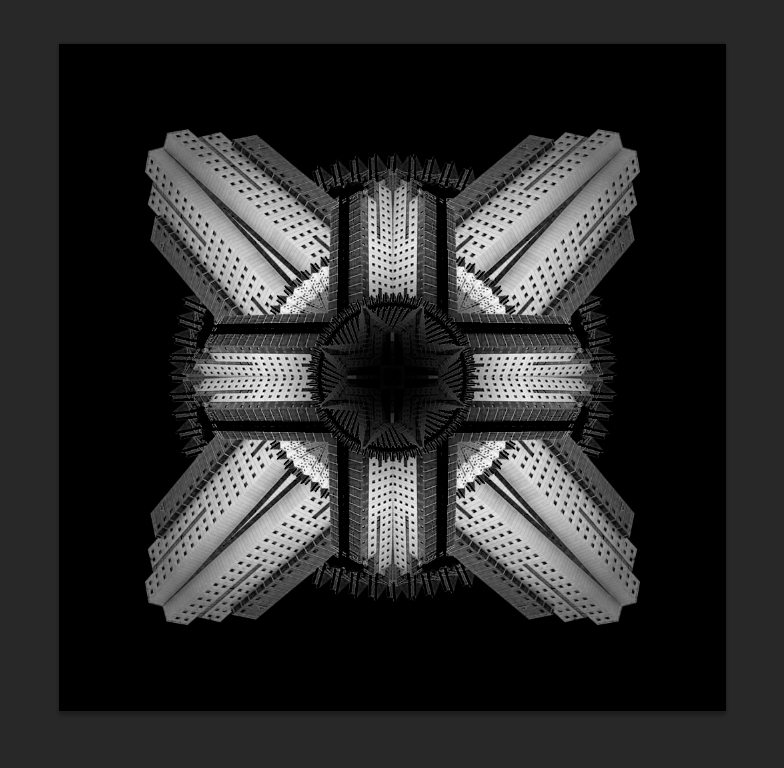
Same applies to the other 2 images, along with different shapes to give a bit of diversity within the series.


This is probably my favourite out of the three as it shows a good range of dark and light colours yet not as sharply as the broadcasting tower image. Hence the reason I have chosen to this to represent the largest photo frame of the three, 8x6 inches.

Image - Design Process - OUGD405

As this module tells you to focus primarily on shape to create your designs, I have chosen a few images I have taken throughout my time in Leeds of interesting buildings. As these are all rectangular, I can manipulate these images and still maintain that relationship between shape and using the images to create texture within the shapes.

6x4 = Holborn Tower.

7x5 = Broadcasting Tower.

8x6 = Opal 3.

As you can see, I have chosen to create a series of images that all represent Leeds in different lights.


Holborn Tower, Leeds.


Broadcasting Tower, Leeds.


Opal 3 Student Accommodation, Leeds.

As you can tell, I have chosen buildings that show a good range of shape within the image, they have all been cropped and a white background added to show how they represent their unique shapes through an outline.

I will later show how I am going to manipulate these images in photoshop to render a kaleidoscope effect.